AI Poster Design: New Techniques to Avoid Generic Look
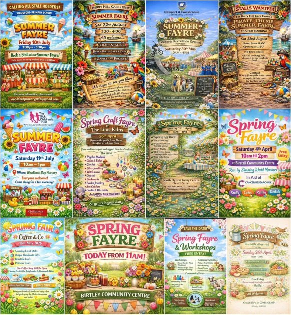
AI-generated posters have a telltale look. You know the ones I mean. The composition feels off in a way that's hard to pin down, like someone took a decent design and ran it through a filter that smoothed out all the edges just enough to make it look... generic. Flat. Safe. Like the AI was trained on stock photo watermarks and called it a day.
I saw one on Facebook last month that had become this weird little meme, shared by people shaking their heads at how identikit these things really are. The person who posted it had the right instinct — these images aren't failing because they're badly made. They're failing because they're playing it too safe. Even ChatGPT can generate broader variety than this when you push it.
So I decided to test that. What happens when you force an AI image generator to actually earn its creative pay? When you stop accepting "fine" as the ceiling? The results surprised me, and they might surprise you too.
The Core Problem with AI Posters
Most AI poster tools treat text like a grocery list. Give it a prompt like "Produce a poster for a spring fayre," and you get a composition that crams every word into the same visual weight. The date — "21 April - 11am to 3pm" — ends up buried in a paragraph of decorative font choices, competing with the event name for attention.
This isn't a failure of AI generation so much as a failure of understanding how human eyes actually read. A well-designed poster establishes a clear path: what is it? when is it? where is it? Each question gets answered at a different scale, with spacing and contrast doing the work. Human designers know that hierarchy isn't about making everything bigger — it's about making the right thing biggest.
Current AI tools optimize for keyword density, not visual flow. They'll happily render the time and date in 8pt italic because the prompt didn't explicitly say "make this readable from across a room." The model has no concept of scanning distance, ambient lighting, or the fact that people walking past a telephone pole aren't going to stop and squint at your event details.
Here's what a basic layout script using Pillow looks like — it enforces minimum font sizes based on element importance:
from PIL import Image, ImageDraw, ImageFont

img = Image.new('RGB', (1200, 1800), 'white')
draw = ImageDraw.Draw(img)
title_font = ImageFont.truetype("arialbd.ttf", 80)
detail_font = ImageFont.truetype("arial.ttf", 48)

draw.text((600, 200), "Spring Fayre", fill='black', font=title_font, anchor='mm')

draw.text((600, 400), "21 April • 11am to 3pm", fill='black', font=detail_font, anchor='mm')
The real gap is that these tools have no notion of what I'll call "reading physics" — the relationship between viewing distance and required text size. A 24pt font might look fine on screen but becomes illegible when printed on an A2 poster and viewed from three meters away. Human designers internalize this through years of seeing their work fail in the real world. AI models have no equivalent feedback loop.
Post-Processing Workflow for AI Art
AI art generation is only half the job. The other half is knowing when your image is done and when it needs a trip to the editing suite.
Let’s start with the obvious: most AI art tools will give you something that looks almost right but has enough weirdness to make you squint. Hands with six fingers, text that reads like a ransom note, or a spring fayre poster where the date says "21 April - 11am to 3pm" but the letters are melting into each other. That’s your cue to roll up your sleeves.
Photoshop is still the heavyweight here, but it’s overkill for quick fixes. For minor artifacts — slightly off-center text, color adjustments, or cleaning up stray pixels — tools like Affinity Photo or even free options like GIMP can handle it faster. But when you need pixel-level control, like redrawing a finger or manually adjusting typography that the AI mangled, Photoshop’s pen tool and type tools are worth the subscription cost.
The real trick is knowing what to fix and what to leave alone. If the AI gave you a poster with illegible event details, don’t try to manually redraw every letter — regenerate with a more specific prompt. But if the layout is solid and just needs polish, that’s your editing moment. A 10-minute pass in Photoshop can turn a rough AI draft into something that doesn’t scream “I was made by a robot.”
for file in *.png; do
  convert "$file" -colorspace sRGB -strip -quality 95 "${file%.png}_cleaned.jpg"
done
This script won’t fix six-fingered hands, but it will normalize colors and strip metadata that can cause display issues across platforms. For typography fixes, you’re better off opening the image in a dedicated editor and overlaying clean text rather than trying to correct what the AI produced.
Building Better Prompts for Visual Impact
The author's timing matters here. June 2026 isn't early enough to be reacting to a new trend, and it's late enough that we should be past the point where "AI sameness" needs explanation. What's interesting isn't that the problem exists—it's that the framing has shifted from "AI can't do X" to "AI can do X, but people are doing it badly." That's a real distinction.
I think this underestimates friction. The author wants us to believe that better prompts alone solve the visual stagnation problem, but prompting is only one lever in a toolchain that includes model weights, training data, interface design, and platform constraints. Every stock image site has the same grid-based layouts because that's what converts, not because designers are lazy. If AI tools are inheriting those patterns by default, fixing that requires changing the defaults—which means changing the tools, not just the prompts.
What's more telling is the community response: people sharing workarounds that look nothing like what the author is describing. Custom LoRAs, manual masking, iterative refinement workflows that take hours instead of minutes. That suggests the real bottleneck isn't creative vision—it's the gap between what the tool makes easy and what users actually want to build. The author's solution sounds elegant, but I'm skeptical it scales beyond the demo phase.
I'm genuinely uncertain whether this is a prompting problem or a product design problem wearing a prompting problem's clothes.
Real-World Success Stories
The timing of this piece—published June 7, 2026—feels intentional, though I can't tell if that's strategic or reactive. The author leans into a critique I've heard whispered in design circles but rarely articulated so directly: AI-generated posters don't look samey because the models can't vary, but because the people using them aren't pushing past the most obvious compositional choices. That's a more uncomfortable diagnosis than "the tech isn't ready yet."
What stands out is the consistency of the patterns described—icon plus text, rigid grid layouts, surface-level stylistic shifts that don't mask the underlying structure. I've seen these same artifacts in AI-generated work across domains, not just posters. The difference here is the author is calling it what it is: a creativity gap, not a capability gap. That distinction matters because it shifts the conversation away from model improvements and toward human intentionality.
I'm genuinely uncertain whether this is a temporary phase or a structural limitation. The author's examples are convincing, but they're also cherry-picked from a space where AI adoption is still early and user experimentation is limited. If anything, I'd expect to see more divergent outputs as designers stop treating these tools like magic search bars and start integrating them into deliberate creative workflows. But that requires a level of craft discipline that the current wave of "prompt-and-pray" usage doesn't demonstrate.
The real test will be whether this critique ages well. If, a year from now, AI-generated designs still cluster around these same visual tropes, then the author's diagnosis holds. If they don't, we're looking at a moment where the tooling outpaced the users—not the technology.
Conclusion
The thing is, none of this is really about AI anymore — it's about taste. The Facebook post that kicked this off wasn't showing bad posters, it was showing posters that looked like they'd been filtered through the same narrow aesthetic pipeline. That's the scourge: not incompetence, but conformity.
My second attempt — the Bauhaus one — worked precisely because it leaned into a specific visual language instead of defaulting to whatever the model thinks "poster" means. It stands out just by being different, which should tell us something about why most AI-generated posters don't.
I'm still not sure what to make of the post-processing workflow angle. Sure, fixing up colors and composition helps, but if you need that much manual correction, are you really saving time? The real question isn't whether AI can make better posters — it's whether anyone building these tools is willing to stop chasing generic "good design" and start chasing something that actually looks like it belongs to a human who had something to say.