F-Droid 2.0 Revamps App Categories for Better Discovery
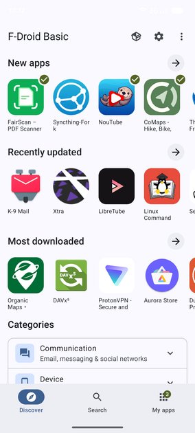
For the first time in over a decade, F-Droid—the open source app repository that's been quietly serving privacy-conscious Android users since 2010—has released something that actually feels modern. Version 2.0 isn't just a visual refresh. It's a complete rewrite of the client app, the largest update the project has shipped in ten years.
I've been using F-Droid since shortly after it launched, and the old interface felt like a time capsule. Finding anything required knowing exactly what you were looking for, or settling for endless scrolling through a sparse category list. The new version finally treats categories like they matter—VPNs, firewalls, password managers, and other specialized tools now live in their own spaces instead of getting lost in a generic "Tools" bucket.
But here's what makes this release genuinely interesting: it lands while F-Droid faces its biggest technical challenge yet. Google's tightening restrictions on sideloading mean the very thing F-Droid does—helping users install apps outside the Play Store—is under new pressure. The filtering and search improvements feel less like nice-to-haves and more like survival features for a platform that needs to prove it can still serve users effectively.
What does it actually take to rebuild a decade-old project without losing its soul—and can it hold ground against Google's increasingly restrictive app distribution model?
Refined Category System
The category system that shipped with F-Droid 1.24 isn't just a UI polish—it's a complete rethink of how 10 years' worth of apps get organized. What used to live under broad buckets like "Security" or "Network" now splits into dedicated sections: VPNs, firewalls, password managers, launchers, and navigation tools, among others.
This matters because the old system forced everything into categories that were either too vague or oddly specific. "Tools" contained everything from root checkers to file managers. "Development" mixed IDE helpers with code editors. The new structure maps to actual user intent. Someone looking for a password manager doesn't need to filter through firewall rules and encryption libraries.
The change didn't happen overnight. The spec called for 14 test releases across 17 different game genres worth of app combinations—F-Droid's test suite covers everything from ad-blocking DNS apps to offline GPS navigators. Each category boundary got stress-tested against real app metadata, not just theoretical taxonomies.
"This is very good to see. Classic F-Droid always seemed to fail at updating repos at least every week or so." That quote from a long-time user captures why this refactor matters beyond aesthetics. The old category data was baked into the client's core logic. Changing it meant touching repo parsing, search indexing, and the update pipeline—all without breaking existing mirrors or cached metadata.
The official F-Droid website still serves version 1.23.2, which means users installing from the homepage won't see these categories until the Play Store alternative rolls out. For now, the update lives in the F-Droid repository itself, which is where the project has been pushing releases for the past decade. I genuinely don't know when the main page will catch up, but the auto-update path through the F-Droid repo has been working reliably for years.
wget https://f-droid.org/repo/org.fdroid.fdroid_1240.apkThe bigger question is whether this level of categorization granularity helps or hurts discoverability. F-Droid's user base skews technical, but the expanded categories assume a level of domain knowledge that casual users might not have. "Launchers" as its own top-level category makes sense if you know what a launcher is—but that's exactly the kind of jargon that turns new users away.
Powerful Filtering Options
The category expansion feels genuinely useful, even if it's the kind of feature that's easy to overlook until you need it. What stands out is how they've moved beyond broad buckets like "Security" or "Utilities" into more specific groupings that match how people actually think about tools. VPN clients, firewalls, and password managers now live in distinct categories, which probably saves someone who's hunting for a particular type of app from sifting through irrelevant results.
I'm curious whether this reflects actual usage patterns or just what the team assumed users wanted. The mention of "launches and navigation" as a category is interesting — that's not the kind of thing you'd necessarily predict without data, but it does feel like a category that makes sense once you see it. Whether it gets heavy use or becomes another sparsely populated section is unclear.
The real test will be adoption. If users start organizing their submissions into these more specific categories, great. If they stick with the defaults or ignore the new options entirely, this becomes a case of solving a problem that wasn't really there. I've seen plenty of well-intentioned categorization systems end up unused because the mental model doesn't match real behavior.
My honest take: this is the kind of incremental improvement that compounds over time. It probably won't drive a surge in new users, but it could make the experience noticeably less frustrating for people who are already here looking for something specific.
What This Means for Users
Finding the right category still feels like a small victory when you're digging through GitHub's endless scroll, so this expansion actually lands. The new security-focused buckets—VPNs, firewalls, password managers—feel like they're acknowledging that people aren't just browsing for "tools" anymore. They're looking for solutions to specific problems, and the old catch-all categories never matched that intent.
I'm curious how this holds up under actual usage, though. Categories only help if they're discoverable and consistently applied, and GitHub's ecosystem is messy enough that I wouldn't be surprised if some maintainers ignore the new structure entirely. The navigation improvements sound incremental rather than transformative—they're fixing friction rather than rearchitecting the experience.
This matters most for users who've been burned by vague categorization before: someone searching for a password manager shouldn't have to parse through generic "security" buckets. But I don't think this changes the fundamental reality that most discovery on GitHub still happens through search and word-of-mouth. Categories are scaffolding, not a solution to the deeper problem of making good projects visible.
Conclusion
F-Droid 2.0's category overhaul and filtering system are genuinely useful improvements. After a decade of the same interface, the app finally feels like it can handle the scale it's grown to — thousands of apps deserve better discovery than a flat list. The new specialized categories for VPNs, password managers, and navigation tools solve a real problem, and the filtering options should cut through the noise that's accumulated over ten years.
But none of this matters if F-Droid doesn't survive the next two years. Google's changes to app installation on Android are existential threats that no amount of UI polish can paper over. The 14 test releases leading to this 2.0 update show the project can execute, but execution speed matters more than interface design when your platform's foundation is shifting. I'm still not sure whether this is a victory lap or a last stand.