Button Design and Its Impact on User Experience
Have you ever stopped to think about how a simple button can change your entire experience with a device? It seems trivial, but in reality, the design and function of buttons play a surprisingly significant role in how we interact with our technology. Take the iPhone, for instance. It’s designed to remember your taps, buffering those commands to ensure a seamless experience. You tap once, and it’s already preparing for the next move, making the interaction feel almost intuitive. Now contrast that with the Nothing Phone, which acknowledges every tap with haptics and sound but ultimately ignores it. That disconnect can be jarring.
I’ve been grappling with this topic recently, especially after working on a big interactive essay that showcased classic desktop designs. I worried that it might come off as outdated, stuck in a bygone era. But the challenges these designs highlight are still relevant, and the conversation about user experience continues to evolve. So why does this matter? Buttons might seem like a small detail, but they reflect a broader trend in user interface design and our expectations for technology. Let’s explore how these differences in button design shape our everyday interactions and what that means for the future of our devices.
The Evolution of Button Design
Button design has come a long way, evolving from mechanical switches to capacitive touch interfaces that we use today. This shift reflects not just advancements in technology but also a deeper understanding of user interaction and accessibility. Mechanical buttons served their purpose well, providing tactile feedback that confirmed an action. However, they were limited in functionality and often posed challenges for users with varying abilities.
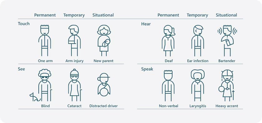
Capacitive buttons emerged as a solution, allowing for more complex interactions while reducing physical wear and tear. Devices like the iPhone and the Nothing Phone have popularized this design, enabling features like image rotation and gesture controls. Capacitive buttons can be responsive to different types of touches and swipes, offering a more versatile user experience. Yet, this innovation comes with its own set of challenges. For example, the very nature of touch interfaces can complicate usage for individuals with certain disabilities. As one commentator noted, "I often keep thinking about the framework of situational disability, stating that disability is not just something that happens to a few people and no one else."
This complexity makes it crucial for designers to consider how users interact with buttons in various contexts. Imagine if you could tap a button three times at any pace without worrying about timing or conflicting animations. As another observer pointed out, "It would be so much more predictable and pleasant if you could just tap the button three times at any pace you wanted without thinking, without paying attention, without getting your UI blocked by an animation that no longer helps you." This insight pushes the conversation around button design toward inclusivity, challenging designers to create interfaces that are both intuitive and accommodating.
In practical terms, developers can test their button designs using simple touch event listeners to capture user interactions. Here’s a brief example of how you might implement a tap counter in JavaScript for a web application:
let tapCount = 0;

// Function to handle button taps
function handleTap() {
    tapCount++;
    console.log(`Button tapped ${tapCount} times`);
}

// Attach event listener to the button
const button = document.getElementById('myButton');
button.addEventListener('click', handleTap);
This code snippet counts the number of times a button is tapped and logs it to the console. It serves as a basic demonstration of how interactivity works and lays the groundwork for more complex interactions that can enhance user experience. As button design continues to evolve, these considerations will play a significant role in shaping how we interact with our devices.
Case Study: Nothing Phone Buttons
The Nothing Phone’s button design departs from traditional layouts, offering a unique user experience. Instead of the standard power and volume buttons, the Nothing Phone incorporates customizable buttons that can adapt to different functions based on the user’s preferences. This flexibility not only distinguishes it from devices like the iPhone but also caters to a broader range of needs, particularly for users who may have difficulty with conventional button interactions.
One of the standout features of the Nothing Phone is its context-aware button functionality. For example, users can program the buttons to perform specific actions based on the situation, like quickly activating the camera with a double tap or launching a specific app with a long press. This approach enhances accessibility, allowing users to engage with their device more intuitively. The design recognizes that disability isn’t solely about physical limitations; it's about creating technology that everyone can use without barriers. The quote about the framework of situational disability captures this sentiment perfectly: "I often keep thinking about the framework of situational disability, stating that disability is not just something that happens to a few people and no one else."
While traditional buttons require a certain level of attention and precision, the Nothing Phone’s design aims for ease of use. The idea is to create a predictable experience, like the quote suggests: "It would be so much more predictable and pleasant if you could just tap the button three times at any pace you wanted without thinking, without paying attention, without getting your UI blocked by an animation that no longer helps you." This approach directly addresses user frustration with standard button mappings and animations that can disrupt the flow of interaction.
In summary, the Nothing Phone’s innovative button layout not only enhances usability but also promotes inclusivity. By allowing users to tailor button functions to their needs, it offers a compelling alternative to traditional smartphone designs. This flexibility could inspire future devices to rethink how buttons are integrated into user interaction, making technology more accessible for everyone.
Case Study: iPhone Buttons
The discussion around the iPhone's single-button interface for transmitting Morse code commands brings to light critical safety considerations. Drawing parallels with the THERAC-25 disaster highlights the potential for catastrophic failures when user input isn’t reliably captured or processed. In that case, the implications are serious: a single button can simplify the interface but also raise the stakes for user errors, especially in high-pressure scenarios where quick and accurate communication is essential.
I find it hard to overlook the community's concerns about safety and reliability. The emphasis on reliable buffering, as noted in how Google Photos handles immediate rotation, is worth considering. When an interface lacks robust feedback mechanisms, it can lead to confusion and mistakes. This speaks to a broader issue in UI/UX design where simplicity must be balanced with functionality, especially when lives may depend on it.
Looking ahead, I wonder how developers will address these challenges. Will we see a push for more complex interfaces that provide users with better feedback, or will the trend toward minimalism dominate, even in critical applications? This isn't just a technical debate; it's about how we prioritize user safety in our designs.
The Psychological Impact of Button Design
The discussion around a single-button interface for transmitting Morse code commands raises significant concerns about user safety and interface reliability. The comparison to the THERAC-25 disaster is particularly striking; that incident serves as a stark reminder of how design decisions can lead to catastrophic outcomes when they overlook user needs and situational context. A single-button setup, while simple, risks oversimplifying the interaction to the point where users may inadvertently send incorrect commands, especially under stressful conditions.
Moreover, the emphasis on reliable buffering in user interfaces is critical. The example of Google Photos illustrates how seamless functionality can enhance user experience. When users can rotate images immediately without delay or buffering, it not only feels intuitive but also reduces cognitive load. If a similar approach isn't taken with Morse code transmission, the result could be frustrating for users, potentially leading to mistakes when every second counts.
There’s a broader implication here regarding how we think about design in high-stakes environments. I find it troubling that the industry often underestimates the psychological impact of interface decisions. A question worth pondering: How can we ensure that the design of critical systems incorporates not just efficiency, but also a deeper understanding of user psychology and situational awareness?
Conclusion
Button design isn't just a relic of the past; it's a crucial aspect of user experience that continues to evolve, sometimes in unexpected ways. The iPhone's approach to tap buffering is a good example of how thoughtful design can enhance functionality, preventing frustration during interactions. Meanwhile, the Nothing Phone's combination of haptic feedback and sound acknowledges the user's need for confirmation but raises questions about how we handle perceived responsiveness.
As we move forward, I can't help but wonder how these nuances will shape our expectations of devices. Will users increasingly demand that every tap feels significant, or will we adapt to a world where buttons become mere suggestions? The direction of button design might just tell us more about our relationship with technology than we'd like to admit.