Does AI Branding Suffer from Visual Conformity?
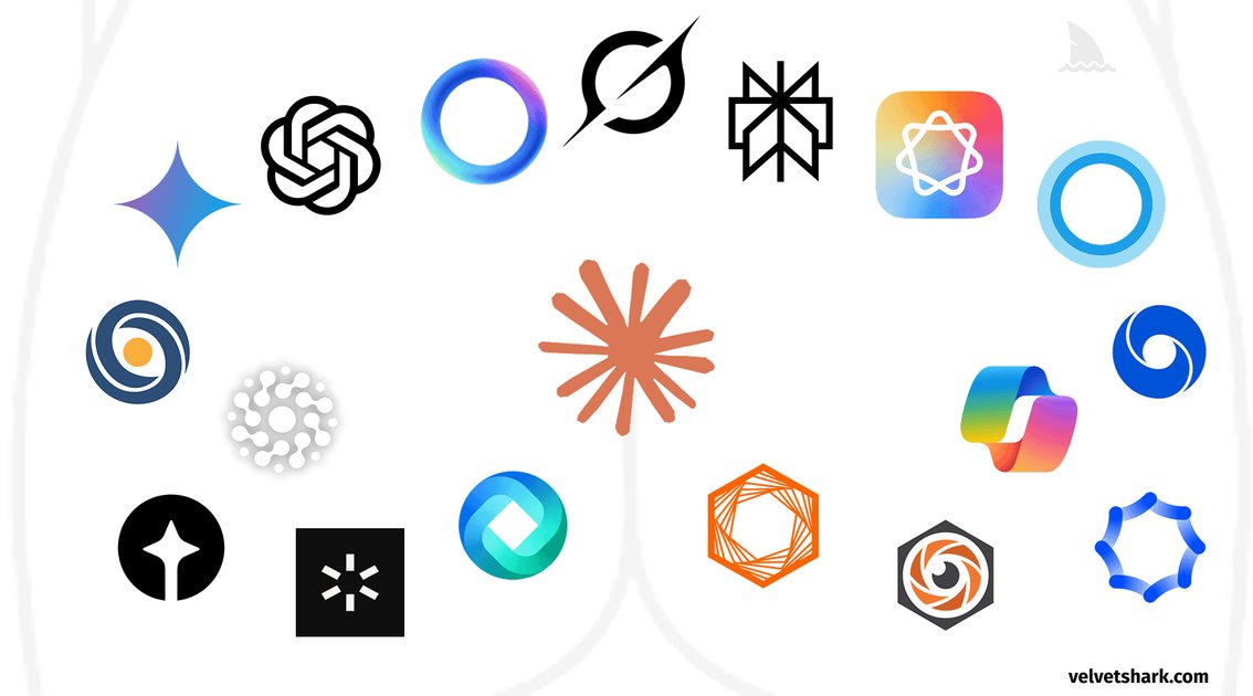
There's a reason why so many "innovative" AI logos inadvertently resemble biological orifices. If you've ever looked at a new LLM startup's branding and thought it looked like a butthole, you're not alone. FastCompany actually wrote a piece about this trend in 2023. I suspect their editors and lawyers wouldn't let them use the title they actually wanted, but the observation holds.
We're seeing a massive wave of pareidolia here. It's the same impulse that made people see a human face in the 1976 NASA photos of Mars. Our brains are wired to find familiar patterns in random shapes. In this case, designers are accidentally recreating biological forms while trying to look "techy."
It's more than just a series of bad design choices. To me, this reveals a weird tension in the industry. These companies scream about disruption and innovation, but they're terrified of actually standing out. There's a crushing pressure to look legitimate by conforming to a very specific, very safe visual language.
The result is a sea of suspicious circular designs that all feel like they were generated by the same prompt. It makes you wonder if the branding is as derivative as the models themselves.
The Pattern of the "AI Orb"
The "AI Orb" is just a radial gradient with a glow effect. It's become the default visual shorthand for intelligence because it's vague. A sphere doesn't imply a specific interface or a set of buttons, which is helpful when companies don't actually know how users will interact with their LLMs. It's a placeholder for "magic" that avoids the baggage of a traditional UI.
This trend is mostly a result of CSS and WebGL making these effects cheap to render. You aren't seeing complex 3D models; you're seeing layers of blurred circles and blending modes. The technical implementation is straightforward:
/* A basic AI orb glow effect */
.ai-orb {
  width: 200px;
  height: 200px;
  background: radial-gradient(circle, #4f46e5 0%, #000 100%);
  filter: blur(20px);
  border-radius: 50%;
  animation: pulse 3s infinite ease-in-out;
}

@keyframes pulse {
  0%, 100% { transform: scale(1); opacity: 0.8; }
  50% { transform: scale(1.1); opacity: 1; }
}
The obsession with concentric circles is a bit lazy. It's a visual cliché that's replaced the "robot hand" or the "brain circuit" imagery of ten years ago. It's a clean look, but it's also sterile. I've noticed that once you see the pattern in one product, you can't unsee it in others. It makes every AI startup look like they're using the same UI kit.
The Legitimacy Paradox
The tension here is that these companies claim to be rewriting the laws of computing while their branding is terrified of a single misplaced pixel. They talk about "disruption" in their whitepapers, but their landing pages look like they were designed by a committee of risk-averse lawyers. It's a weird paradox: the technology is chaotic and experimental, but the presentation is sanitized.
This corporate polish extends to how they handle community engagement. You'll see a high-level executive post a "raw" thought on X, only to follow it up with a link that looks like this:
<!-- A typical corporate CTA disguised as a personal recommendation -->
[If you like what you see, you'll find more stuff like this on my Twitter.](https://twitter.com/company_exec)
It's an attempt to mimic human connection using a template. Once you notice the pattern, you can't unsee it. The "authentic" voice is just another layer of the product design.
The mismatch is most obvious in the technical specs. They'll brag about a 40% increase in inference speed but wrap that data in a pastel-colored gradient that feels like a fintech app for teenagers. It's a strange choice. If the tech is actually this powerful, why is the aesthetic so timid?
Pareidolia and Biological Forms
The trend toward these concentric, organic-looking logos is less about a new design language and more about a collective lack of imagination. When every AI company tries to signal "intelligence" or "neural networks" using the same set of soft gradients and circular apertures, they end up in a visual dead zone. I think the community is right to mock the "butthole" aesthetic; it's a visceral reaction to a corporate attempt at minimalism that has stripped away all actual meaning.
This matters because it reveals how the "AI aesthetic" is currently just a mirror of founder preference. There is no established grammar for how an LLM or a diffusion model should look visually, so we're getting these vaguely biological shapes that feel like they were generated by the very tools they're branding. It's a loop. The functionality of the product has nothing to do with a swirling iridescent void, yet that's the default choice for anyone trying to look "modern."
I'm not sure if this is a temporary phase or if we're just stuck with these shapes until the hype cycle actually produces a distinct visual identity. The real question is whether we'll eventually move toward more utilitarian, boring branding, or if the industry will just keep iterating on slightly different versions of the same circle.
The Cost of Visual Safety
The "aperture" aesthetic isn't a design choice based on user psychology or brand science. It's a reflection of a very small circle of founders who all look at the same Dribbble shots and think "this looks like intelligence." I think the community reaction—specifically the "butthole" comparisons—is actually a useful critique of the current AI design language. When a logo looks like a generic geometric void, it signals that the company is prioritizing a vague sense of "futurism" over any actual connection to the product's utility.
This matters for the brand's longevity, but not for the product's current growth. People don't stop using a tool because the logo is ugly; they stop when the tool stops working. However, we're seeing a pattern where the visual identity of these companies is as derivative as the early versions of their LLMs. It's a loop of aesthetic imitation.
I'm genuinely curious if we'll see a "visual correction" where companies intentionally move toward ugly, high-friction, or brutally utilitarian design just to signal they aren't another wrapper. Or will we just be stuck with a decade of concentric circles?
Conclusion
The "AI Orb" is essentially a security blanket. It’s funny that companies claiming to disrupt every industry are terrified of picking a logo that doesn't look like a sanitized gradient circle. OpenAI’s pivot from a simple text mark to that central void—all in the name of "fluidity and warmth"—is just a textbook example of playing it safe.
We're seeing a paradox where the most "innovative" tech on the planet is being wrapped in the most boring visual language possible. I'm not sure if this is a conscious choice to signal legitimacy or if designers are just collectively exhausted. Either way, the result is a sea of branding that looks less like the future and more like a medical diagram of a cell.
Will we actually see a brand break this cycle, or are we stuck with a thousand more variations of the same circular void?