How Demo Scene Interfaces Optimized 7 MHz Hardware
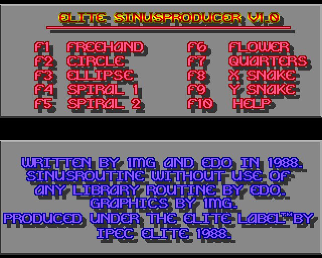
Modern UI is all about accessibility and frictionless experiences. It's designed to get out of the way. But the demo scene treated the user interface as a high-performance art piece, specifically designed to push 7 MHz hardware to its absolute limit. It wasn't about utility. It was about seeing how much visual chaos you could squeeze out of a machine that was never meant to do it.
I've spent a lot of time in this subculture. It's a motley gang of creative nerds who treat assembly language like poetry. When you look at something like Elite Sinus by Ipec, you aren't looking at a video file or a pre-rendered animation. These are real-time programs. The code is calculating every pixel and every sine wave on the fly, often while fighting the hardware for every single clock cycle.
It's an obsessive way to write software, and it's mostly irrelevant to how we build apps today. But there's something honest about it. There's a specific kind of magic that happens when you stop worrying about the user and start worrying about the silicon.
The real question is how they actually pulled this off without the luxury of modern compilers or gigabytes of RAM.
The Constraint of the 7 MHz CPU
A 7 MHz CPU is incredibly slow for calculating real-time geometry. Because of this, the minimalist look of early Amiga demos isn't an aesthetic choice; it's a technical requirement. You can't calculate complex sine waves or perspective transforms on the fly without the framerate tanking. To get fluid motion, programmers had to "cheat" the hardware.
The most common cheat is the lookup table, or precalc. Instead of asking the CPU to calculate a trigonometric function 60 times a second, you calculate the values once and store them in an array. The CPU then just grabs the nearest pre-calculated number from memory. This part is genuinely confusing for people used to modern GPUs, because you're essentially trading memory for CPU cycles.
// Precalculated sine table for a 7 MHz CPU
float sine_table[256];

void init_sine_table() {
    for (int i = 0; i < 256; i++) {
        // Calculate once at startup so we don't do it in the main loop
        sine_table[i] = sin(i * 6.283185 / 256);
    }
}
Real-time demos are not movie files; they're code generating frames on the fly. When you see a smooth plasma effect or a rotating cube, you're seeing a series of clever optimizations. If the math takes too long, the screen tears. To keep things fast, developers relied on:
- Precalculated lookup tables
- Fixed-point arithmetic to avoid slow floating-point operations
- Direct hardware register manipulation
Interaction as Performance
Demos aren't just video players; they're real-time software. Every effect is calculated frame by frame. On a 7 MHz Amiga CPU, doing complex trigonometry or physics in real time is impossible. To get around this, developers use "precalc," which is just a fancy way of saying they use lookup tables. Instead of calculating a sine wave 60 times a second, the code just reads a pre-computed value from a list in memory.
This constraint creates a tension between a functional UI and a "showcase" interface. If a user interacts with a demo, that input can't eat into the CPU cycles needed to maintain the frame rate. Most demos handle this by making the interface a separate, low-priority loop or by using a "semi-automatic" mode. In these cases, the user doesn't control the math; they just trigger pre-set state changes. It's a cheat, but it's the only way to keep the visuals smooth.
This part is genuinely confusing because it blurs the line between a program and a movie. If the "interaction" is just skipping to a different pre-calculated sequence, is it actually interactive? I'm not sure. But from a technical perspective, it's a smart trade-off.
// A simple lookup table for a sine wave to save CPU cycles
float sine_table[256];

void precompute_sine() {
    for (int i = 0; i < 256; i++) {
        // Calculate once at startup, not every frame
        sine_table[i] = sin(i * 6.28318 / 256);
    }
}
Visual Language of the Demo Scene
The nostalgia in the comments is a bit of a distraction. People are treating this like a digital museum exhibit, reminiscing about C64 disk magazines and the specific way trackers handled sound. But looking past the sentiment, the real takeaway here is how the demo scene basically invented the modern concept of "squeezing" performance out of hardware. They weren't just making art; they were treating the machine's limitations as a game.
I think there's a risk of over-applying these lessons to today's stack. We have so much abstraction now that the kind of low-level trickery used in the demo scene is mostly irrelevant for 99% of developers. It's a different world when you're fighting for every single byte of RAM. That said, there is still a gap in how we think about visual efficiency. Most modern software just throws more compute at a problem until it works, which is a lazy habit we picked up in the era of cheap cloud scaling.
The real question is whether that "limit-first" mindset can actually survive in a world of infinite resources, or if it's just a historical curiosity that only matters to people who remember what a disk magazine felt like.
Legacy of the Demo Scene in Modern UI
The nostalgia in the comments about C64 disk magazines and early copying tools isn't just a trip down memory lane; it's a reminder that the "hacks" we see in modern UI—like extreme optimization or unconventional visual flair—started as a necessity. When you only have 64KB of RAM, you don't follow a style guide; you bend the hardware until it does what you want. I think we've lost some of that scrappiness in the era of 16GB browser tabs. We've traded that raw, hardware-level creativity for consistency and accessibility, which is a fair trade, but it explains why modern interfaces often feel sterile compared to the chaos of a 90s demo.
The mention of "sinus" in music software is a good example of how the terminology of the demo scene just leaked into the professional tools we use now. It's a quiet kind of influence. It isn't some massive shift in how we design apps, but rather a set of fingerprints left behind by people who cared more about squeezing out one more pixel or one more synth channel than following a specification.
I'm not convinced that this "demo spirit" can actually survive in a corporate design system. Most modern UI is built to be invisible and frictionless, whereas the demo scene was about being noticed and intentionally provocative. I wonder if we'll ever see a return to that level of visual aggression in mainstream software, or if we've permanently optimized the "soul" out of the interface in exchange for a lower bounce rate.
Conclusion
Looking back at the "Flower" option or those flashing red and cyan help screens, it's easy to mistake this for mere nostalgia. But there is something genuinely irritating about how we handle hardware today. We've traded the ingenuity required to squeeze a sine wave out of a 7 MHz CPU for a "just add more RAM" mentality.
I'm still not sure if the demo scene's obsession with flashing raster bars and high-contrast chaos actually translates into a useful lesson for modern UI, or if it was just a very specific, very loud way of shouting "look what I can do" at a machine that shouldn't have been able to do it.
Whether it's a functional legacy or just a digital circus, the question remains: when was the last time you saw a piece of software that cared more about the 7 MHz it was running on than the telemetry it was sending back to a server?